Wednesday, March 25, 2020

2D earthquake beachball diagrams in QGIS

Earthquake focal mechanism solution (FMS) diagrams (a.k.a. beachball diagrams) allow the quick visualization of the attitudes of the two possible fault planes (i.e. the nodal planes: the fault plane that moved, and the auxiliary plane) and the slip sense (i.e. normal, reverse, strike-slip, or oblique) associated with an earthquake event, as determined from waveform data. This article will guide you in displaying beachball diagrams in QGIS.

Some background on the concepts used for the visualization

As stated above, FMS diagrams show the two nodal planes and their associated slip senses. An important relationship between the two nodal planes is that they are perpendicular to each other. As such, we only need information on one of the nodal planes to construct the beachball diagram. Specifically, we need the attitude of the fault (strike and dip) as well as the slip sense (rake). We would also need the location (latitude and longitude) of the earthquake epicenter for plotting. The data source that we will be using for this tutorial is the Global Centroid Moment Tensor (GCMT), using the psvelomeca output option. Of course, other data sources may be used, provided they have the minimum required information (latitude, longitude, strike, dip, and rake).

To display the beachball diagrams in QGIS, we need a way to associate the correct symbology for every possible combination of strike, dip, and rake values. To do this, the following techniques are employed: 
  1. Representation of all possible strike values through the data defined override option for rotation in the symbology panel in layer properties. This is applicable since the strike value only rotates the FMS diagram.
  2. Following (1), we need to create FMS diagrams for all possible combinations of dip and rake values for a north-striking fault plane (strike = 0 degrees). Obviously, this is a lot, since dip values range from 0 to 90 degrees, and rake values from -180 to 180 degrees. For the purposes of this tutorial, I opted to create symbology for all dip and rake value combinations in 5-degree increments. In total, I have created 1,387 FMS diagrams, which you may download here.

Let's start!

Step 1: Copy the FMS svg symbology in your QGIS svg directory. Make sure to extract the content of the .rar file, which is a folder named zfocmech. If you installed QGIS using the Standard Installation option using OSGEO4W Network Installer, the svg directory would likely be located in: C:\OSGeo4W64\apps\qgis\svg. After copying, the 1,387 FMS diagrams should be located in C:\OSGeo4W64\apps\qgis\svg\zfocmech.

Figure 1. FMS diagrams in the zfocmech folder within the QGIS svg directory.

Step 2: Download your data. If you want to use GCMT data for your area, click here. Make sure to select the GMT psvelomeca input option, which gives the strike, dip, and rake values of the nodal planes. You may also opt to follow this tutorial using the same data set that I'm using.

Figure 2. The GCMT search web page.

Step 3: Prepare the data. Open the file in Excel (or other spreadsheet). We have to create a column which will reference the appropriate FMS svg symbol for each earthquake.

Figure 3. The sample data set in MS Excel.

Since our FMS diagrams are for dip and rake value combinations in 5-degree increments, we have to round up the dip and rake values into the nearest 5-degree increment. For this tutorial, I will be using the strike, dip, and rake values for nodal plane 1 (str1, dip1, r1), although using nodal plane 2 should produce similar results.

To round the dip values (dip1) to the neares 5-degree, I used the formula: 

=ROUND(dip1/5,0)*5

Similarly, for the rake values (r1), I used the formula:

=ROUND(r1/5,0)*5

Figure 4. The sample data set with new columns for the dip (Column L) and rake (Column M) values in 5-degree increments.

Create a new column containing the corresponding svg symbology, by using the CONCATENATE function. For the sample data set, I used this formula for the first earthquake, and applied it to all the events in the data set:

=CONCATENATE("C:\OSGeo4W64\apps\qgis\svg\zfocmech\",L2,"_",M2,".svg")

The result of which is the directory of the corresponding FMS svg symbology:

C:\OSGeo4W64\apps\qgis\svg\zfocmech\40_-75.svg


Figure 5. The sample data with the new column for the corresponding svg symbol (Column N).

Save the file as a tab delimited text file (.txt). Here is a sample spreadsheet of the data set with the data preparation outlined above.

Step 4: Open the file in QGIS. Go to Layer > Add Layer > Add Delimited Text Layer... or use Ctrl+Shift+T to open the file. Make sure to toggle the necessary options, such as the delimiter used (for the sample data, we are using Tab),  and the geometry (point coordinates) and the X and Y field (longitude and latitude, respectively). For the sample data, see Figure 6.

Figure 6. The Data Source Manager dialog box for opening delimited text file. 

The opened file should show the earthquakes plotted with default symbology (simple marker).

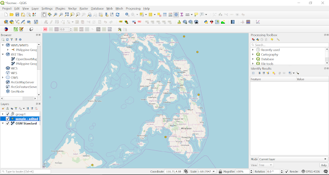
Figure 7. The sample data set rendered with simple markers. The basemap is OSM Standard WMS layer, obtained using the QuickMapServices plugin.

Step 5: Edit the symbology. In the Layers Panel, right click the data layer and select Properties. Then click the Symbology tab to open the Symbology Editor window.

Figure 8. The symbology editor.

Change the symbol layer type to SVG Marker. Scroll down until you reach the bottom of the window. We need to perform a data-defined override to assign the correct svg file (as we assigned in Step 3) for each earthquake event. Click on the Data-defined Override icon > Edit... (See Figure 9).

Figure 9. The data-defined override icon (see red arrow).

The Expression String Builder window should appear. In the central panel, double click on the field name you assigned for the svg directory (see Step 3), under the Fields and Values. The output preview, which is shown at the bottom left corner of the window, should show an example of the svg file directory. Click OK.

Figure 10. The expression string builder window.

We also need to apply a data-defined override for the symbol rotation, in order to account for the strike values (see Background). Click on the Data-defined Override icon > Assistant beside the Rotation field.


Figure 11. The rotation data-defined override


Set the source field to the field name which contains the strike values (str1 for this tutorial). Set the values to range from 0 - 360 degrees for both input and output. Click OK.

Figure 12. The rotation data-defined override assistant. 1) the field name for the strike values; 2) and 3) are the settings for the input range.


Finally, add another marker below the SVG markers we have already set up, by clicking the + button. Feel free to play with the stroke width and the fill color and transparency settings. For example, you may also use the data-defined override for the fill color to visualize depth variation among the earthquake hypocenters. 

For this tutorial, I opted for a 4 mm size for the SVG, while a 3.8 mm size, a 0.2 mm stroke width, and a solid white fill for the simple marker. Click OK.

Figure 13. The symbology editor window.

The results should look like something like this.

Figure 14. Earthquake beachball diagrams in QGIS!

Other tips

  1. Background colors that visualize depth variation of the earthquake hypocenters. This may be achieved by applying data-defined override for the color of the underlying simple marker, if you have depth data (The GCMT psmeca output includes depth values).
  2. Size that reflects the magnitude of the earthquake. This may also be achieved by applying a data-defined override for the size of the layer symbology.

Future works

I am currently working on visualizing 3D beachball diagrams in QGIS, using the qgis2threejs plugin.

Monday, August 21, 2017

Pseudokarst in Guintabon volcanic bombs

Photo 1. Road going to Lake Balinsasayao.
San Jose is a municipality of Negros Oriental.
Taken from: http://www.thelonerider.com/2010/
dec/balinsasayao_bike/images/terrain_map.jpg
The term pseudokarst refers to karst-like features that formed wherein solution is not the dominant process, in contrast to true karsts. Among many examples that would not be discussed here, pseudokarst in volcanic landscapes have been described, such as lava tunnels, lava tubes, lava stalactites, lava stalagmites, and rough surfaces above a lava field, where the ceilings of lava tubes have collapsed. 

Here, I would like to make a case of probable pseudokarst features in volcanic bombs found along the footslopes of Guintabon in Negros Oriental, Philippines.

A fine example of a volcanic bomb showing pseudokarst features is shown in the photograph above. Its composition is that of basalt, with numerous andesite xenoliths. This example measures roughly 2 m x 4 m. While it is not the only example found in the area, this example shows the most well-developed pseudokarst features.

Photo 2. Volcanic bomb showing probable pseudokarst features, found along the road halfway to Lake Balinsasayao. Note the flute-like features, much like solution runnels (rinnenkarren) found in karst environments. Scale: Human around 5 feet high.
What is easily seen in this volcanic bomb are fist-wide vertical flutes rimming the circumference of the bomb, much like the solution runnels (rinnenkarren) found intrue karsts. The interior of the runnels are smooth walled, and show no difference in appearance compared to other parts of the  bomb. This likely points that these runnels formed at the same time the volcanic bomb is cooling, that is, when it was still up in the air.


Photo 3. A close up of the volcanic bomb shown in Photo 1. One of the runnels (left side of the picture) appears to be smoothed by overland flow, but overland flow alone is not likely to produce these features, as explained below. A hornblende-phyric andesite xenolith is found in a cavity 10 inches below the compass, and a larger one 10 inches SE of the compass. Vesicles can also be observed. The other white spots are lichen growths. Scale: A compass, roughly 5 inches in diameter. 
The volcanic bomb is shaped akin to that of a gas stove flame, with curved bases and flared tops. I think this shape is most likely a response to the aerodynamic drag such a large bomb creates as it falls from the sky.

But what is clear is that these features are not a result of solution, such as by rain. For a place like Philippines in which rain is ubiquitous, such features, if a result of solution by rain, should be the norm rather than the exception.


Monday, April 10, 2017

Approximating the orientation of the fault that caused the Batangas Quake - #EarthquakePH

Picture 1. Earthquake generation is usually
explainned through the Elastic Rebound Theory
April 8 this year, 3 strong earthquakes hit Batangas: a magnitude 5.7 at around 3 pm, follwed by a 5.9. These were again followed by a magnitude 5.7 within 20 minutes.

We might be familiar of the fact that earthquakes, at least the tectonic ones, happen when stored and accumulated stress on rocks finally overcome its strength, and these are associated along faults, where two rock masses move past each other. However, for the area hit, no such faults were identified at the surface, as shown by the image below.

Picture 2. Seismicity Map of Region IV - A (Source: PHIVOLCS)
Fortunately, PHIVOLCS - Seismic Observation and Earthquake Prediction Division (SOEPD) continually updates a publicly-accessible page recording data - coordinates, magnitude and depth - for every earthquake at least magnitude 1 that occurs in the Philippines. I've plotted the epicenters of all the earthquakes that have occurred around the Batangas area for the month of April, as shown below.

Picture 3. Earthquake epicenters of the area (April 2017).
As we can see above, the earthquake epicenters already show a NNW trend, which would imply that the fault that has caused these quake swarm occurs this orientation.

Now, if we plot the earthquake foci, we could see the dip, and the planar feature of this previously unknown fault. I plotted the earthquake foci using QGIS 2.8.2, with the help of the Qgisthreejs plug-in. Here is an image, showing views parallel and perpendicular to the fault's approximated strike (around N 20 W).

Picture 4. Profile showing earthquake foci for the Batangas earthquakes and aftershocks. Magnitude increases as the bubble size increases, and as color changes from blue to red. 2x vertical exaggeration. Dip angle was measured to be 88 degrees, and by quick calculation (dip angle measurements in exaggerated scales must be corrected), the dip was found to be 86 degrees.
While what I have shown lies more on an illustrative  side, allow me to take a guess, and say that the attitude of the fault that caused the Batangas quakes is around N 20 W, 86 NE.

Tuesday, January 26, 2016

Use of soil maps in geology

Being a student geologist from the Philippines, one of my biggest frustrations when going out in the field is the veneer of soil and 'lush' vegetation which hides the underlying lithology of the area.

This situation is unavoidable as my place, Negros Oriental, is in a tropical climactic zone - sunny, humid, and plenty when it comes to rainfall - which promotes intense chemical and biogenic weathering. This in turn accelerates the processes of soil formation.

But actually (as I have realized from one of my great epiphany moments), you could use soil maps, and a little knowledge of pedology (the study of soils), to aid you in uncovering the lithology of an area!

Here is how I intend to use this new-found knowledge in one of my assigned work in our Principles of Stratigraphy class.

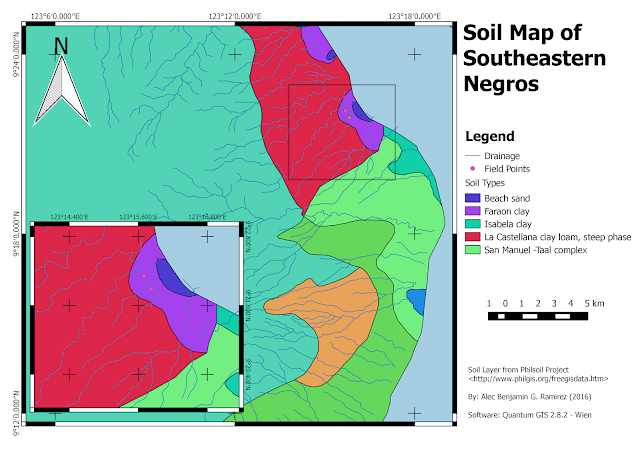
As you could see below, the area I am concerned about (labelled Field Points) has a soil cover made up of the Faraon clay variety.

Picture 1. The Soil Map of South-eastern Negros
Consulting an authorized literature, such as the Simplified Keys to Soil Series - Negros Oriental (Philippine Rice research Institute, 2014), the Faraon clay series is "a calcareous, fine-textured soil with less than 65% clay, developed from the weathering of the soft and porous coralline limestones..."

Thus, without going to the field, I now have an idea about the lithology of the area I am studying, that is, it is composed of coralline limestones. This means that this area has been underwater, as coralline limestone are only deposited in shallow marine environment.

But of course, verification must be achieved if possible. Below, you could see a picture of a building stone and sand quarry in the area, which shows the subsurface strata.


Picture 2. This shows the quarry excavation found in the area. Note the thick limestone cap on top, with the thin Faraon clay soil series on top of it, as seen clearly below the bamboo. Below the limestone cap lies a thick, matrix-supported(?) calcareous conglomerate of cobble to boulder -sized clasts. Further below are interbedded alluvial sands(?) and pyroclastics. Image courtesy of Gladys Magsanay (2016).
Because of this verification, we can now infer from the soil map that those areas covered by the Faraon clay  is underlain by either a limestone cap, or a calcareous conglomerate bed.

Of course, this method of inference can only be used for residual (or authigenic) soils, which are formed from the weathering of the rock at source itself. In contrast with the allogenic soils, which are transported from another place, the soil type would tell the lithology of the source of the soil itself.

There are many other ways to incorporate soil maps in geologic analysis. Arguably, they are important tools that student geologists should be familiar about them.